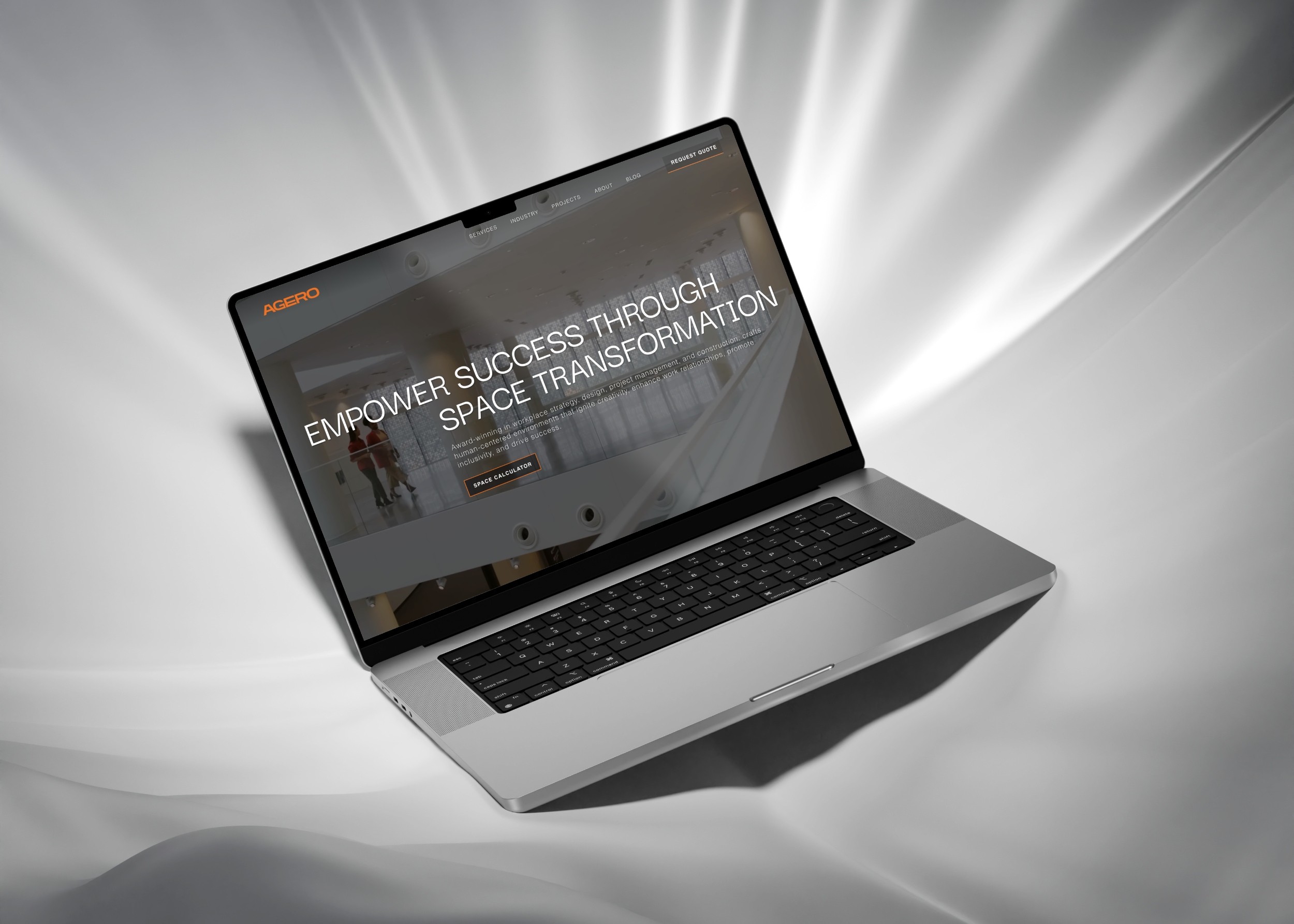
AGERO
*
AGERO

AGERO
*
AGERO

AGERO
*
AGERO
Post-rebrand to attract high-quality leads from Lockheed Martin in the USA
Post-rebrand to attract high-quality leads from Lockheed Martin in the USA
Brand Refresh | Web Redesign
Brand Refresh | Web Redesign
Commercial Real Estate
Commercial Real Estate
Time: 2023
Time: 2023
Summary
Agero had a solid reputation, industry connections, and strong project management skills, but its digital presence and brand consistency were lacking. To differentiate itself and attract more lucrative commercial contracts over office fit-outs, Agero needed to update its digital identity to reflect its expertise. The co-founders aimed to refresh the brand while retaining key elements of its identity and improving overall sales conversion rates.











UX Audit
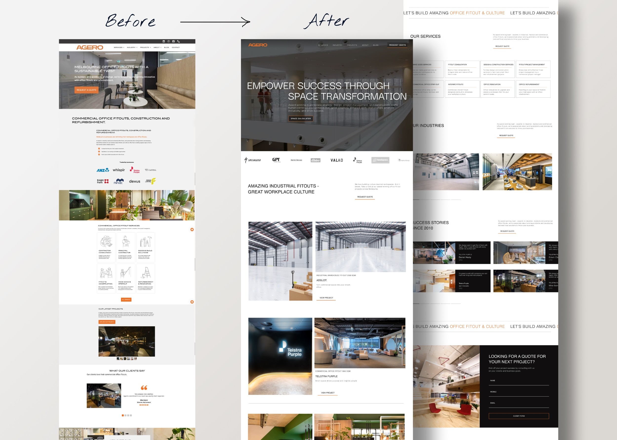
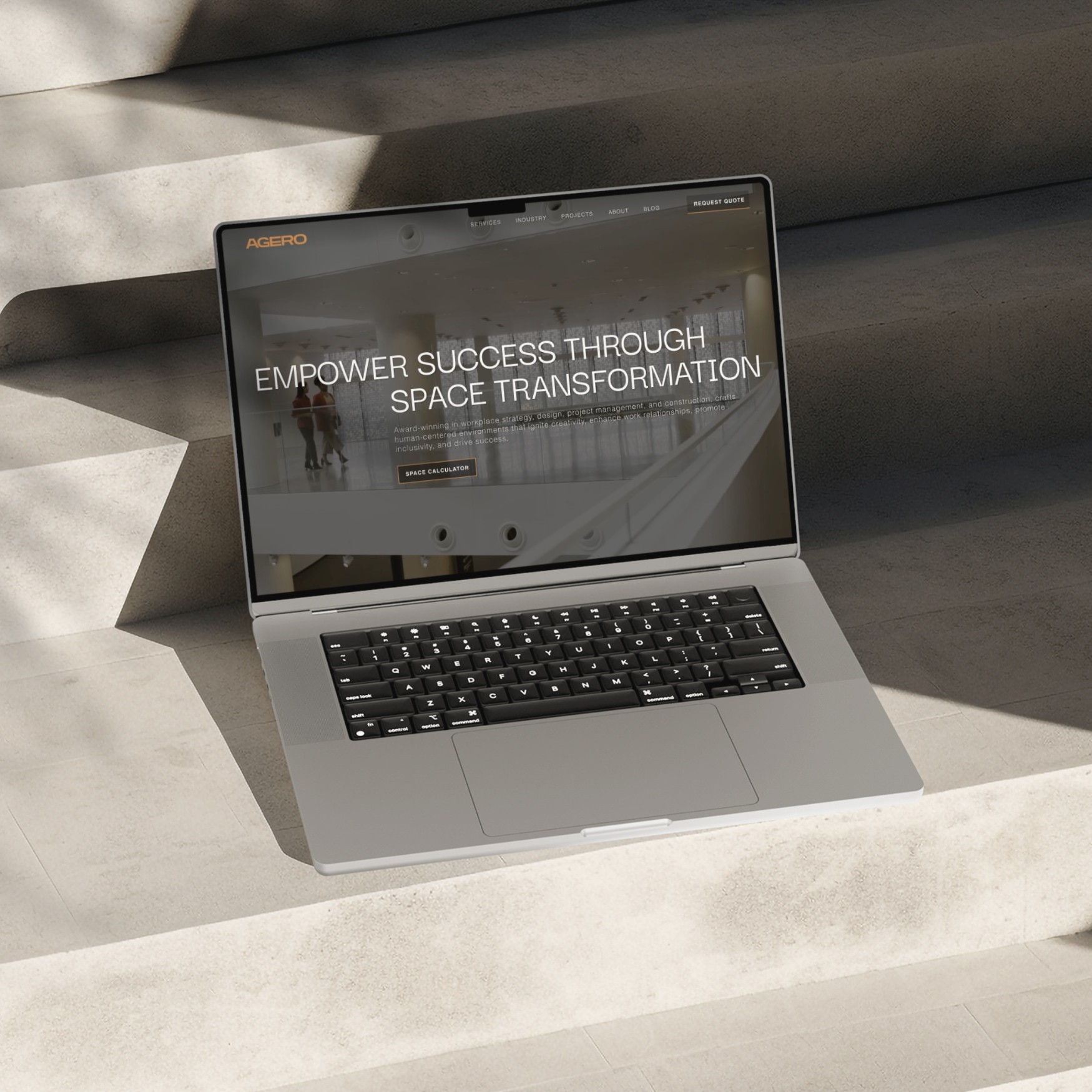
I conducted a comprehensive UX audit, covering content, UI/UX, social proof, and CTA copy. Identified issues with Hero auto-rotating carousels (unreadable headline), redundant navigation icons (increased bounce rate), low color contrast (accessibility), and brand inconsistency in design elements, along with an unclear unique sales proposition.
Layout problems included cramped spaces, disproportionate logos, and weak visual hierarchy due to mismatched color ratios for brand colors. These issues contribute to a high bounce rate and leave users feeling confused.
Approach
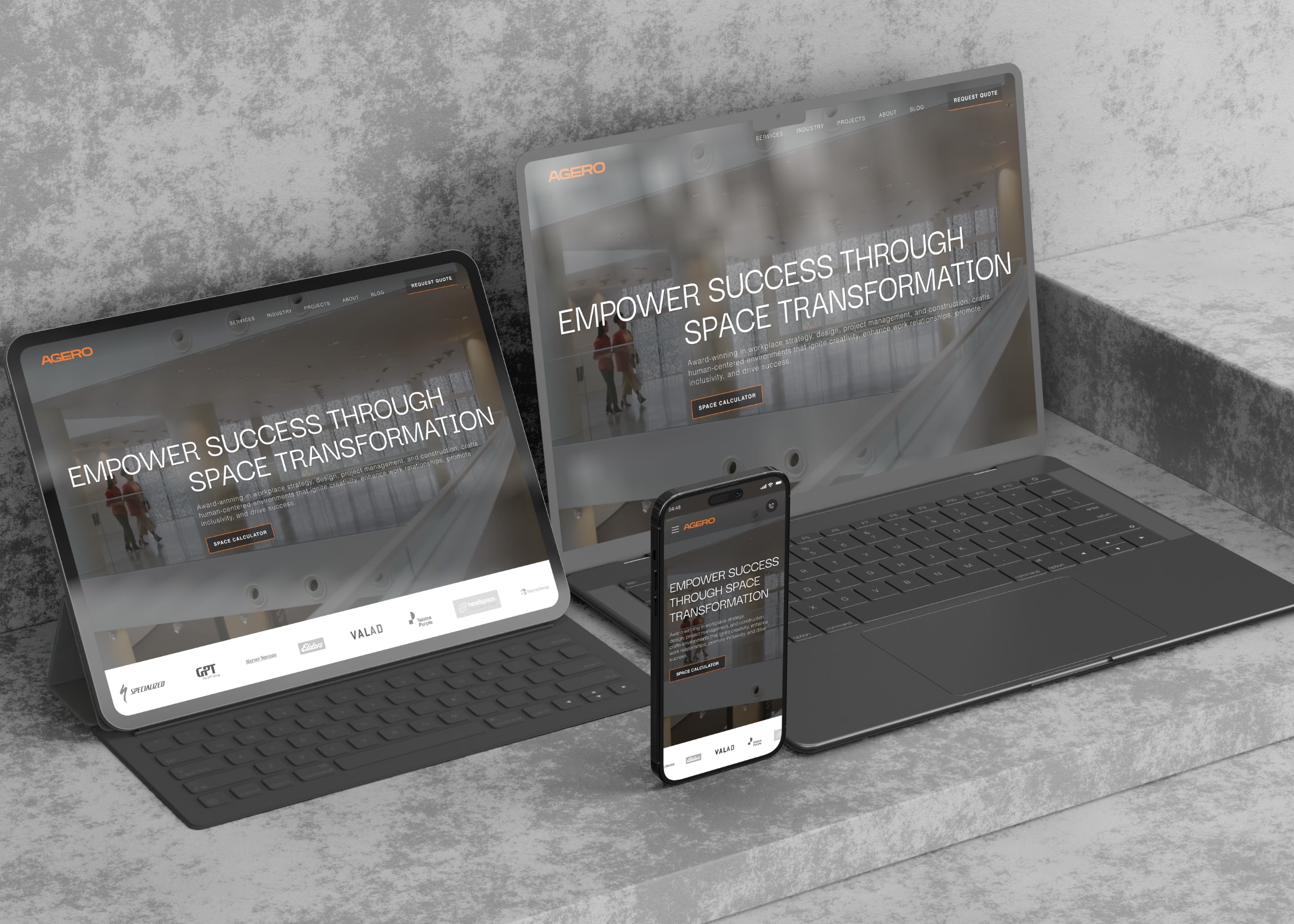
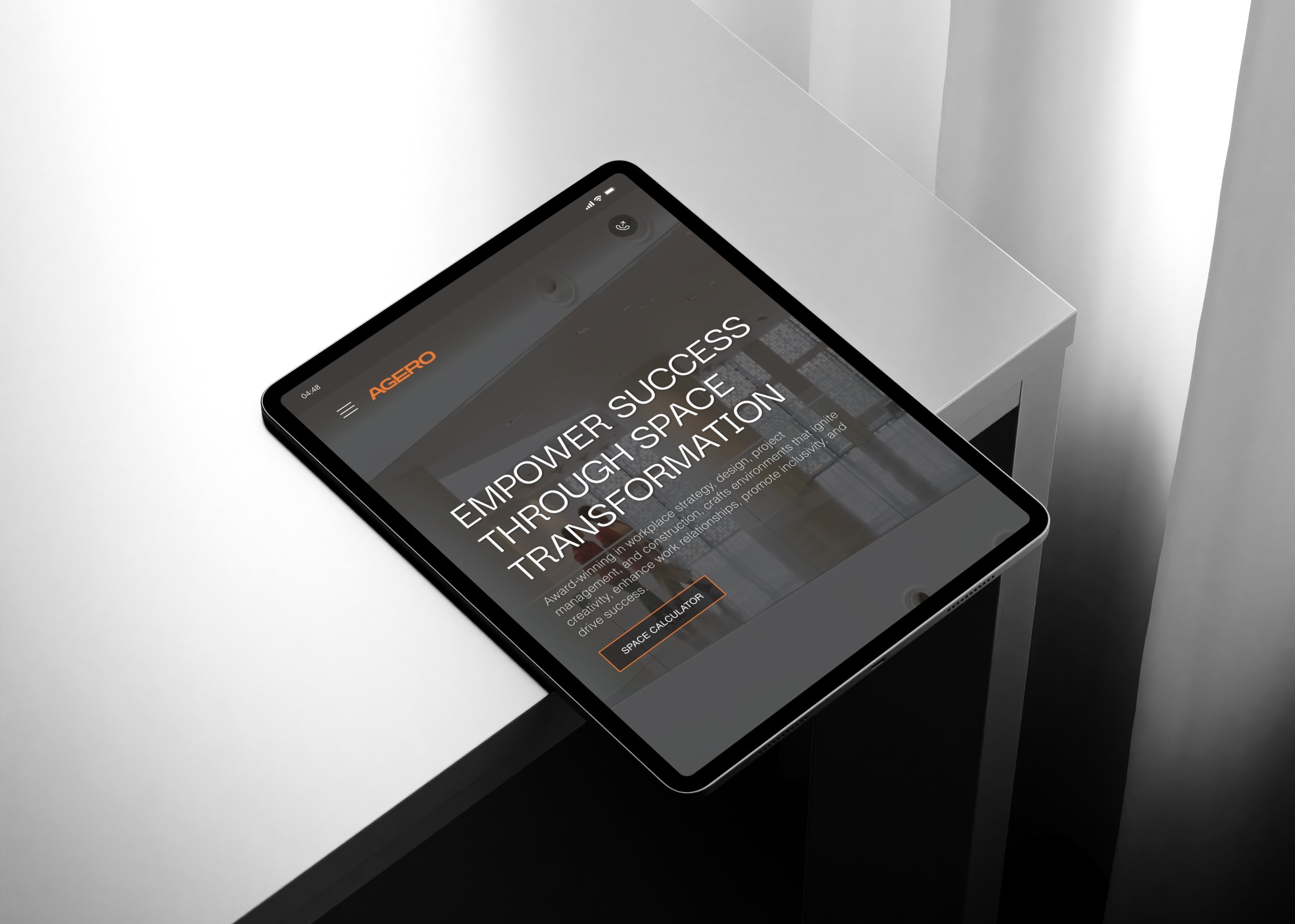
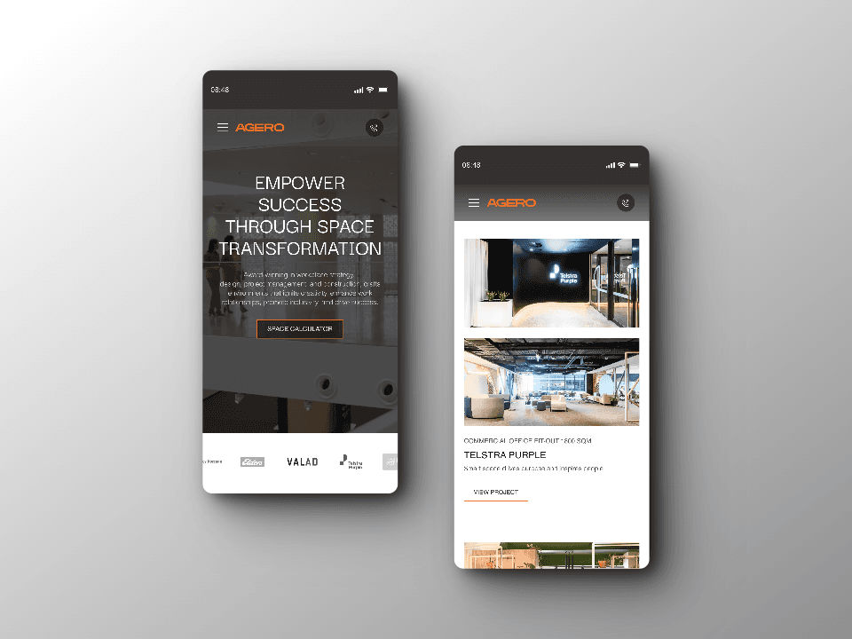
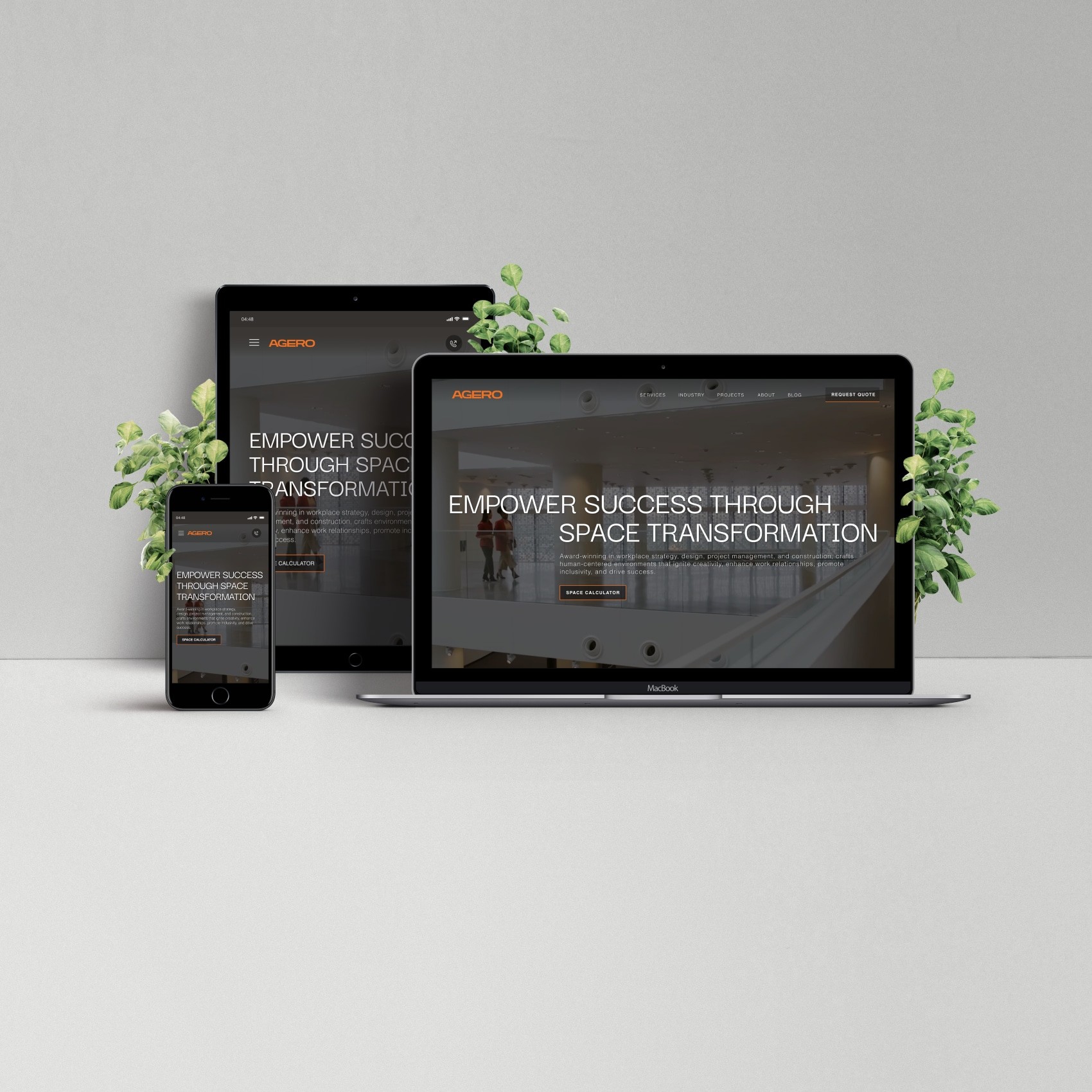
Based on a combined analysis, I found that 70% of our traffic comes from mobile devices, with most leads being cold; 80% of visitors only browse the homepage.
With these insights, I developed strategies with a focus on Mobile CRO:
Content:
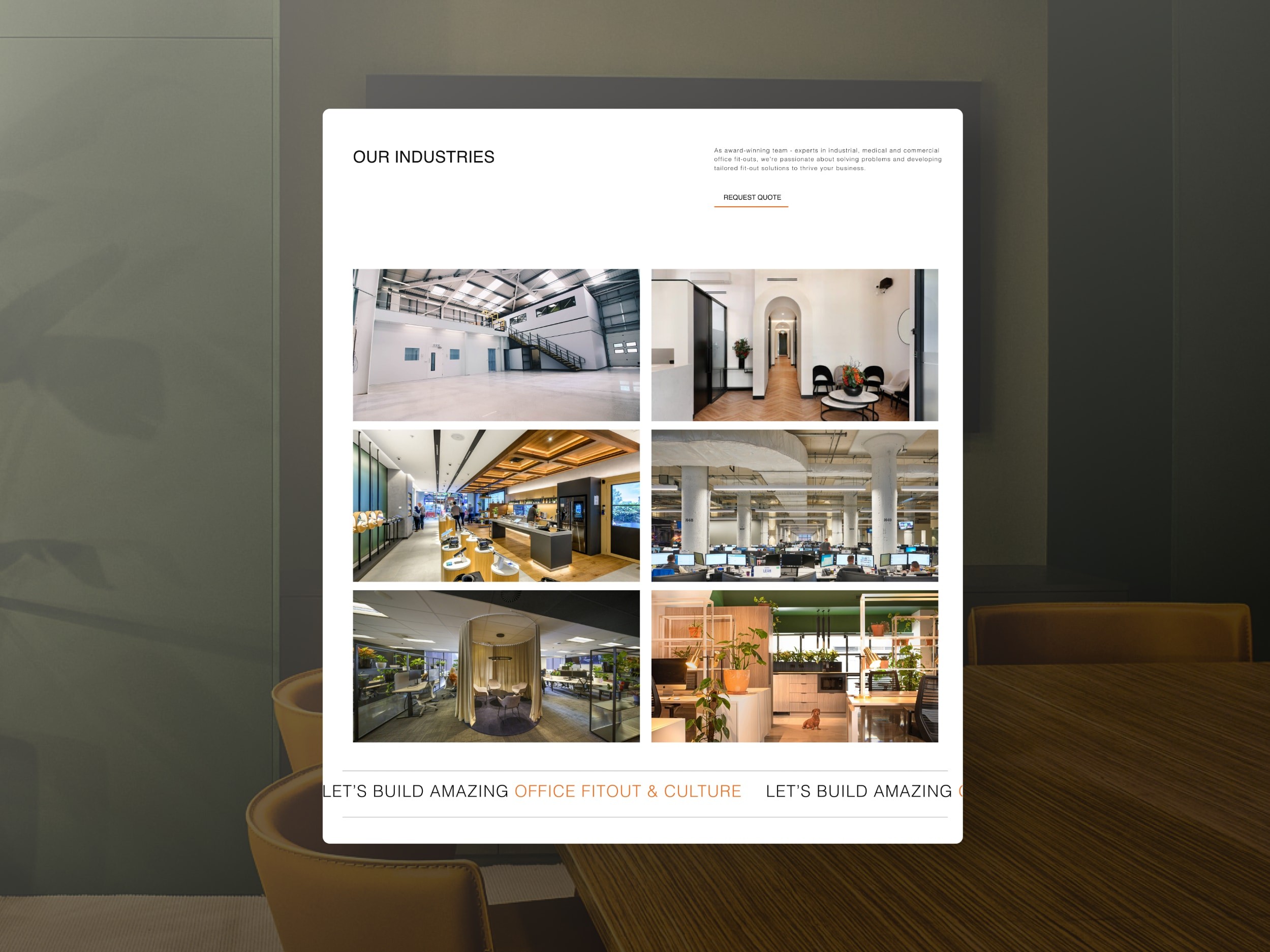
Implemented structured content to nurture cold leads, generously showcasing the portfolio below the fold on the homepage and linked to its corresponding case study (SEO). Enhanced hero H1 copy to encourage scrolling.
User Interface:
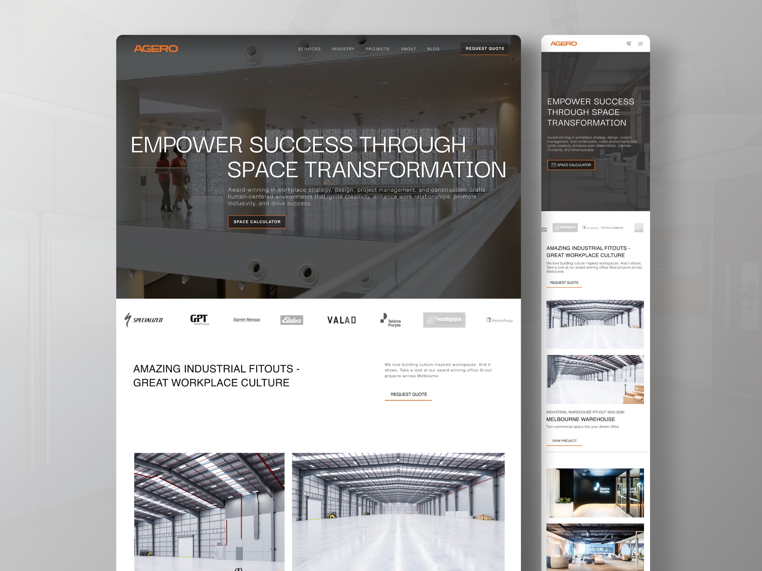
I switched out carousels for full video hero backgrounds to better capture the brand concept—enhanced color contrast and readability to comply with WCAG accessibility standards and improved overall brand consistency.
User Experience:
I remapped the user flow and navigation to enhance accessibility. To boost conversion rates, I eliminated redundant icons, reducing bounce rates, and introduced a sticky header featuring a prominent CTA (call-to-action).


Results:
Following a successful brand refresh and strategic repositioning, Agero experienced a significant surge in high-quality leads through Google AdWords, attracting prestigious clients such as Lockheed Martin.
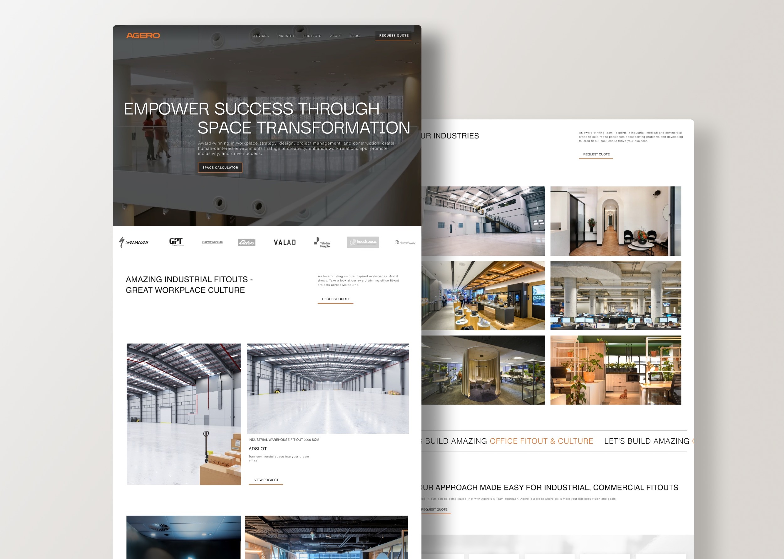
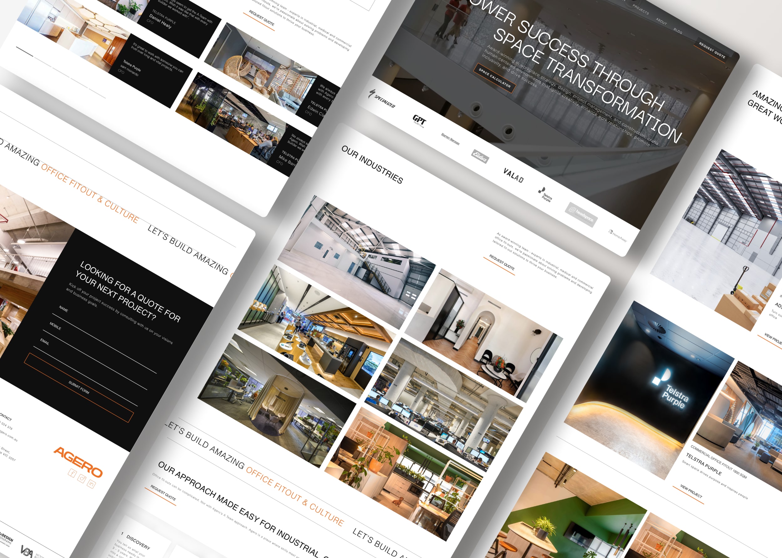
With Agero's evolution from a modest office fitout firm to a commercial fitout powerhouse, the redesigned website now showcases its capabilities through captivating portfolio photography. The introduction of sleek loading animations adds an additional touch of elegance, captivating visitors and leaving a lasting impression.
Results post-redesign home page:
62% decrease in drop-offs
54% increase in click-through rates
22% boost in sales conversions








Brand Concept
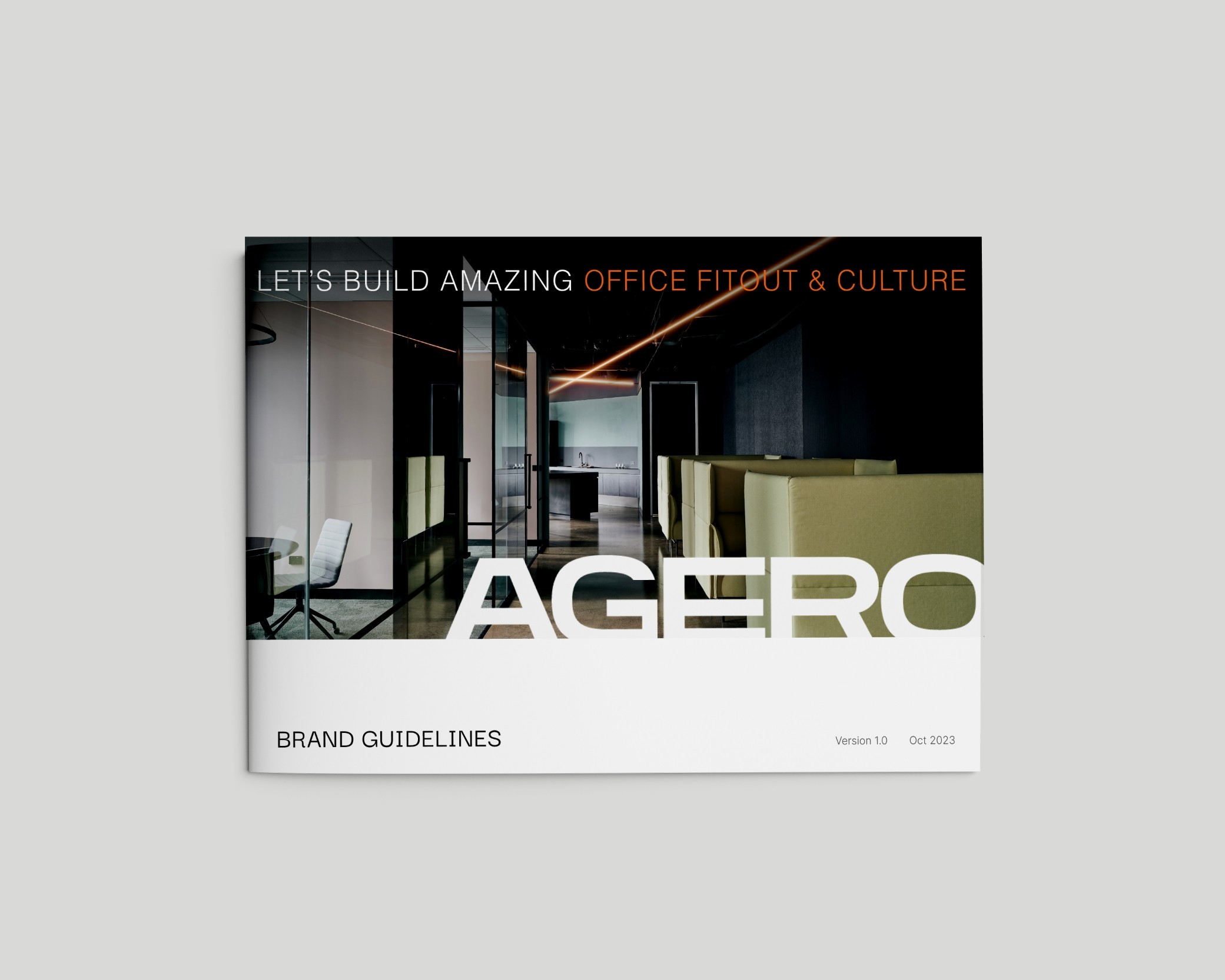
The refreshed brand concept revolves around creating a sense of spaciousness, characterized by a sleek, rectangular, and horizontally scrolling design.
With subdued supporting visual elements and a monochromatic color palette, Agero's portfolio imagery takes center stage. Reflecting visual design focus elements: modernistic, upmarket, forward-looking, and professional.
Typography
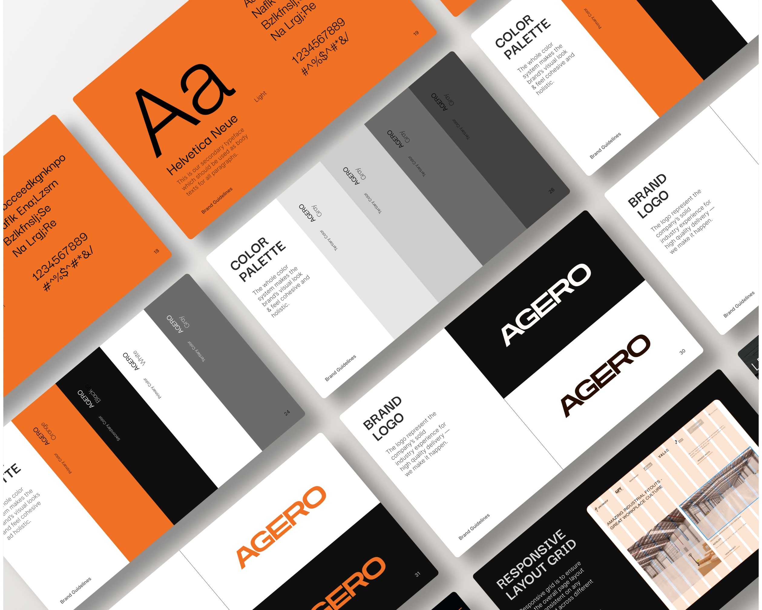
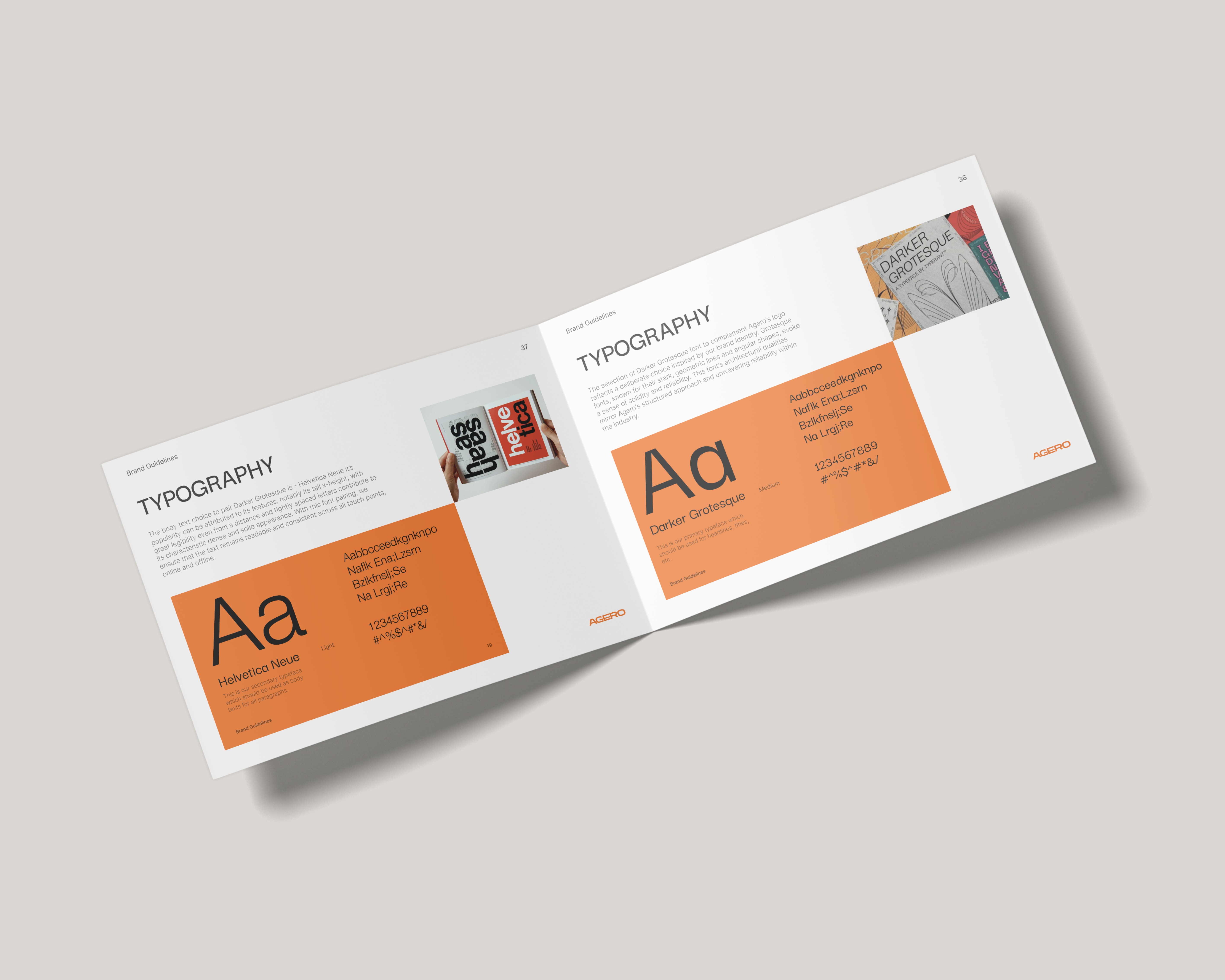
The hero text and H1 headings feature Darker Grotesque, a contemporary grotesque font known for its slightly crude appearance and sleek, geometric feel. It offers good legibility with fairly even stroke weights.
Paired with Darker Grotesque is Helvetica Neue for the body text. Helvetica Neue is popular for its tall x-height, contributing to legibility even at a distance, and its tightly spaced letters create a dense, solid appearance. This font pairing ensures readability and consistency across all touch points, both online and offline
Color Palette
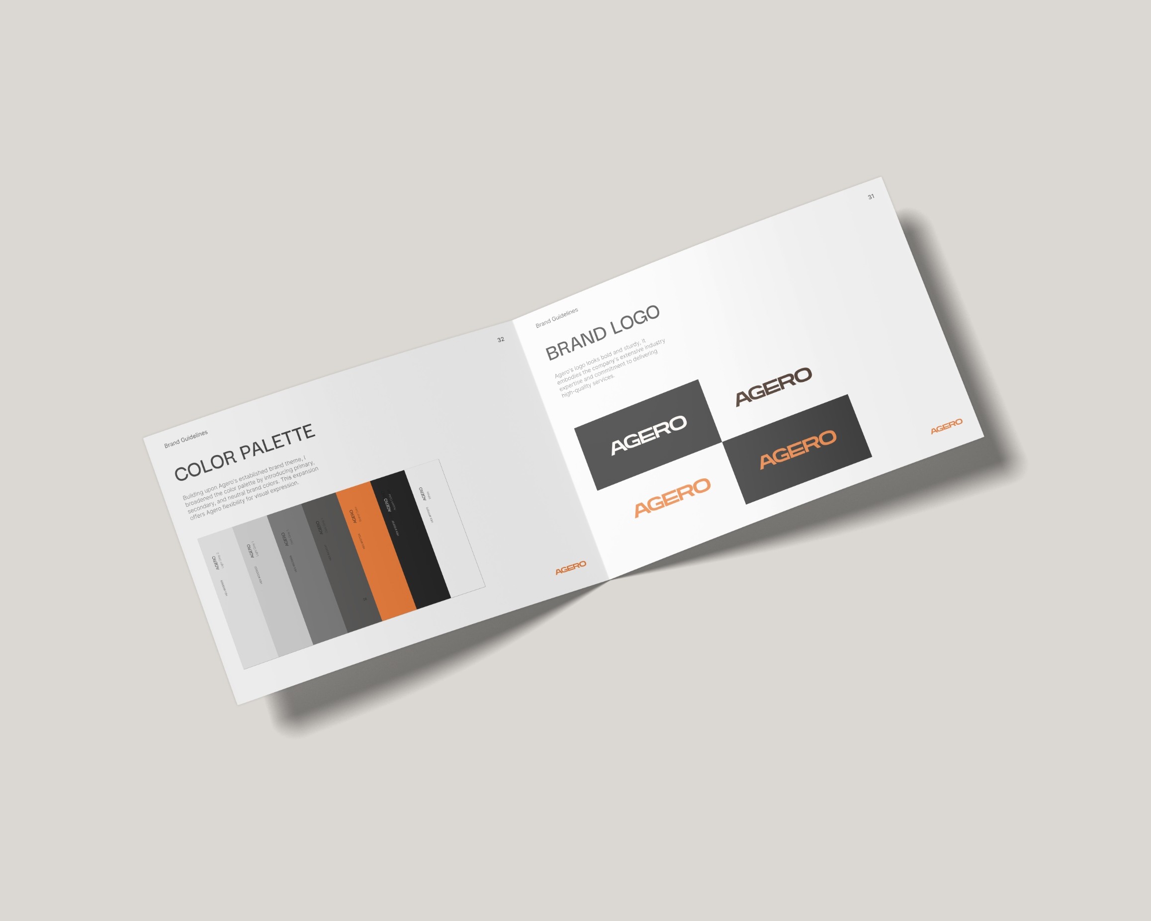
I used a minimal, monochromatic color palette, with the brand's orange serving as an accent rather than the primary color.
This color combo not only fosters a sense of spaciousness but also ensures that our content and imagery to take center stage. It's a reflection of Agero's updated brand personality—modernistic, upmarket, forward-looking, and professional.
Visual Identity
Imagery
The previous layout cramped images with insufficient spacing, resulting in a disjointed appearance that failed to showcase Agero's work effectively.
The new moonboard, inspired by global art galleries, features large rectangles with ample white space, brilliantly showcasing Agero's portfolio. Subtle loading animations enhance visual impact and leave a lasting impression on visitors.
